Background
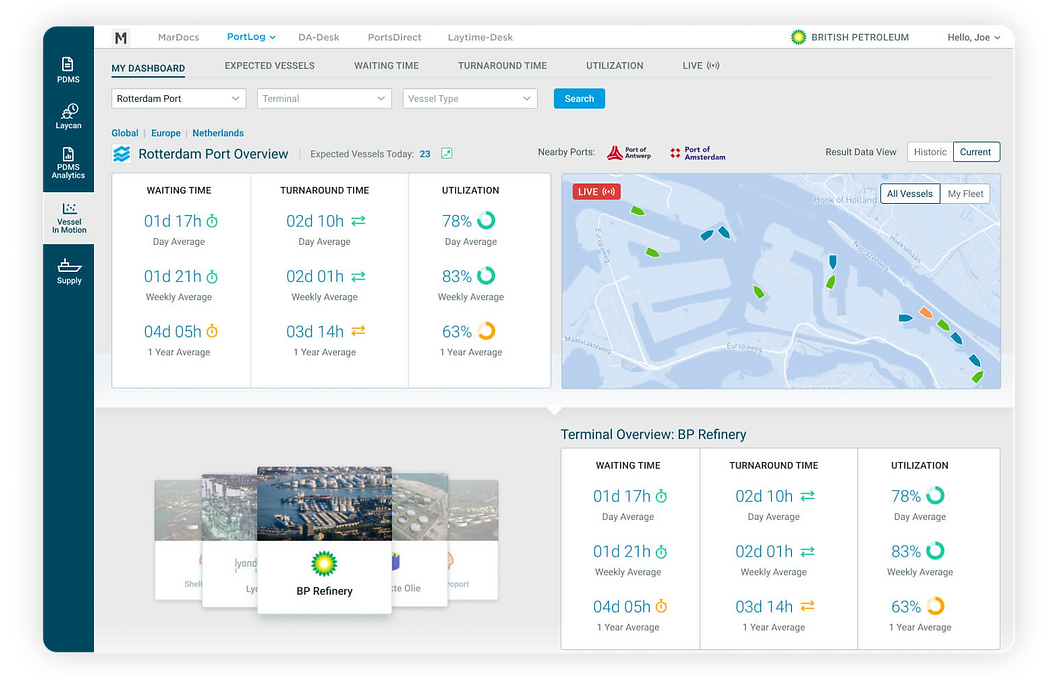
We were approached by the client to produce a proposal for an application that will be the single source of all integral information help them on managing their voyages.
Due to the lack of a single source for all the information they might need, they end up subscribing to different online paid and free information providers. This means it takes a lot time for them to sift through dozens of posible resources, get what they actually need and combine them into a single document which they use as reference.
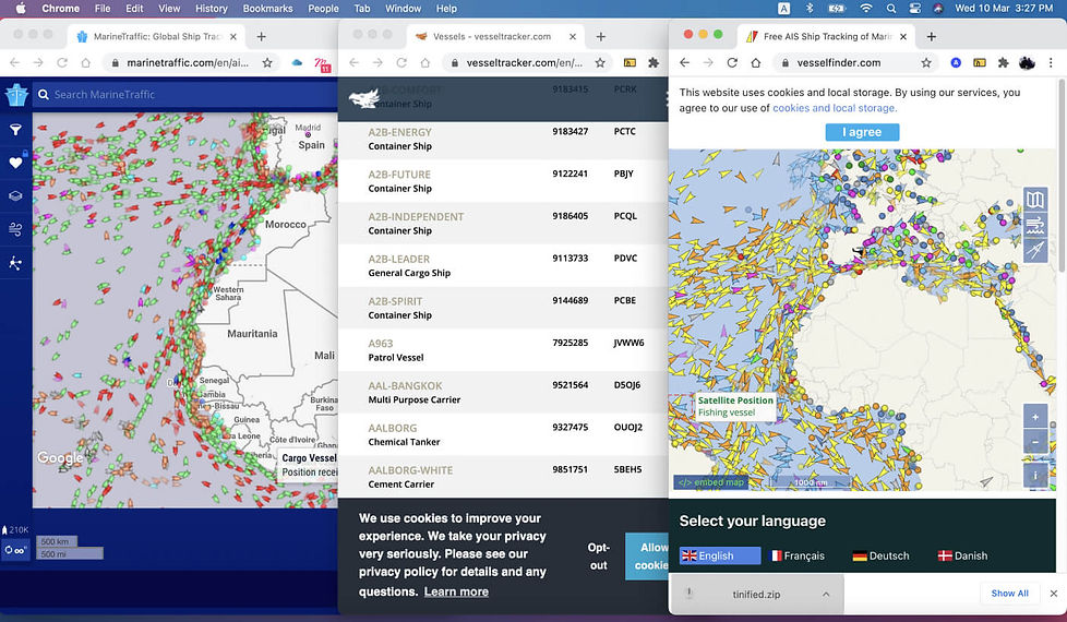
The operator usually opens a couple of websites for reference in different tabs and then copy the information they need into their document.
Developing the design
We only had less than 2 weeks to present our idea so we did not have enough time to go through the usual design process. Fortunately, I was working with people who were knowledgeable and had worked in the shipping industry.
We had a kickoff meeting to plot out the main features and information that we see as critical in planning the voyages. We listed the most important information that is needed and grouped them into sections. Took notes of the possible information we can include in these sections and useful functionalities we can incorporate.
The data that we needed to display was dense and technical, so most of the time, I needed to check with my colleague to properly understand the process and see if the design made sense for someone like him. We would do these short discussions and testing 2-3 times a day to make sure we are on the right track and not waste time.

A quick sitemap and content draft sketched out together with 2 of my colleagues
Knowing that the client may not be able to appreciate a wireframe, we decided to work on a high-fidelity design that would be more appropriate and better explain our idea.
Using our notes and sketches, I started working on the design. I shared the Figma file with my collaborators, they filled the design with real information, checked and commented on the design, and put themselves in the target user's shoes if the data, flow, and functionalities made sense. This way, we were able to quickly validate the design and make the proper amends.
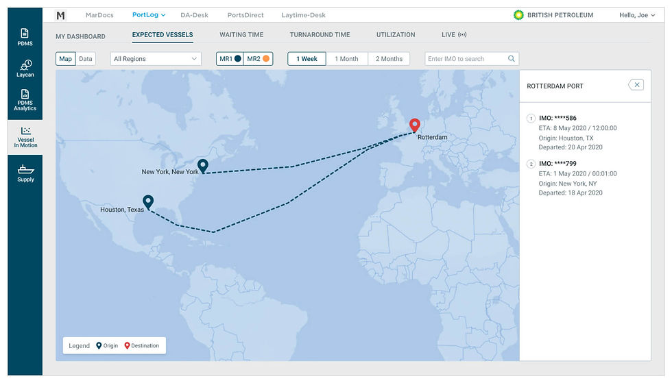
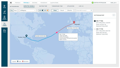

Expected Vessels section provides real-time travel timeline and information from point A to B
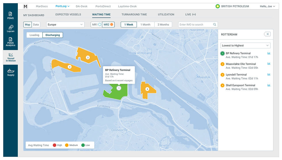

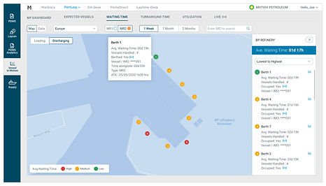
Waiting Time section provides real-time loading and discharging waiting times for terminal and berth level, enabling users to select which termninal or berth that suits best to their needs

Turnaround Time section provides the average turnaround performance for each available terminal or berth which helps arrive at an informed decision when choosing where to dock their vessels
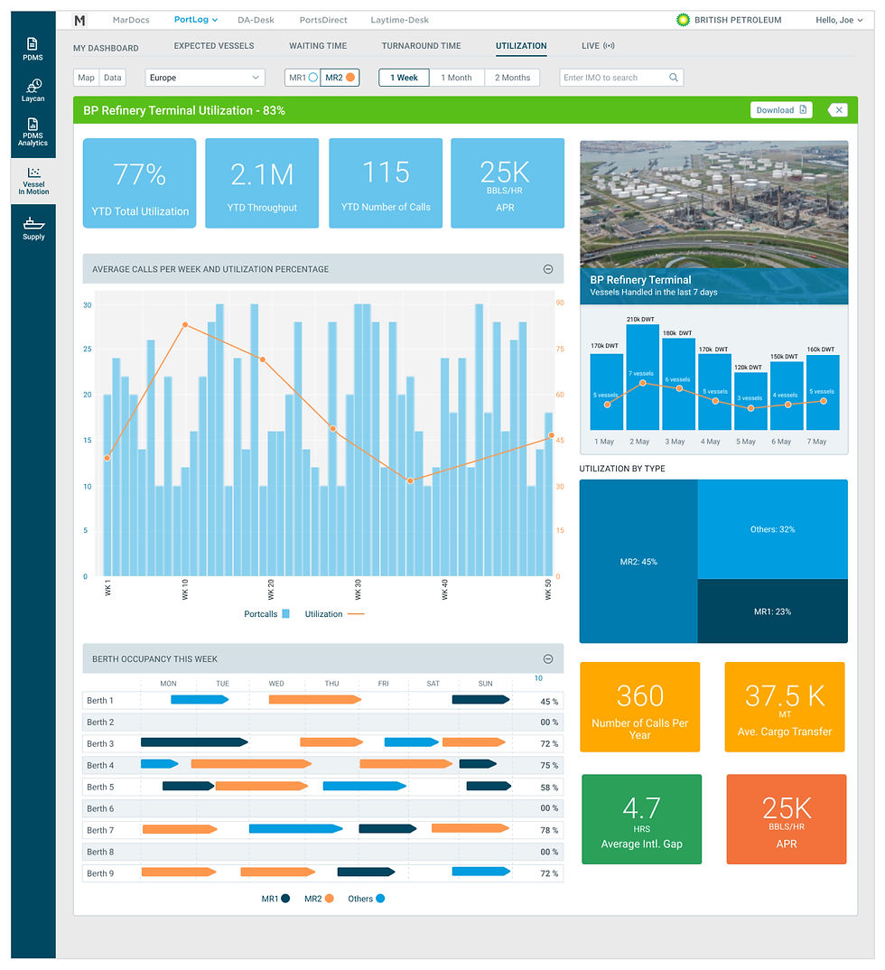
The utilization section provides an overview of a terminal's performance

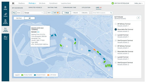

The Live section provides information of vessels and their information currently docked on the terminals and berths
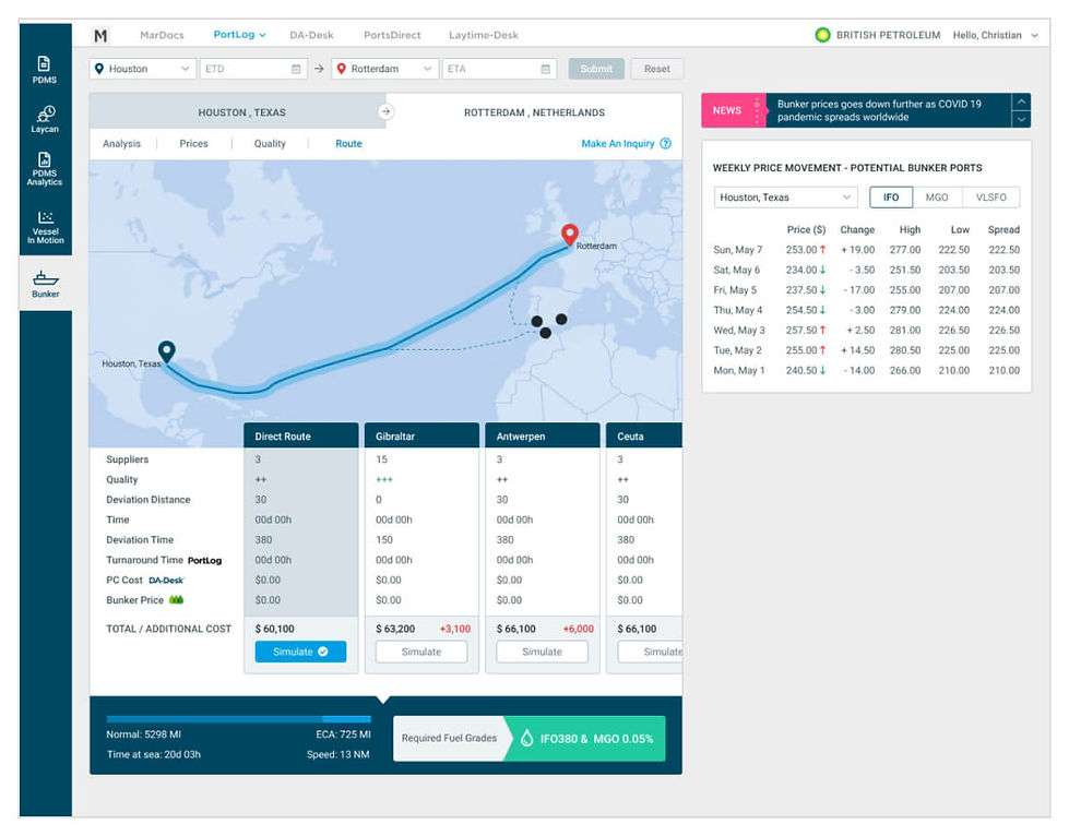
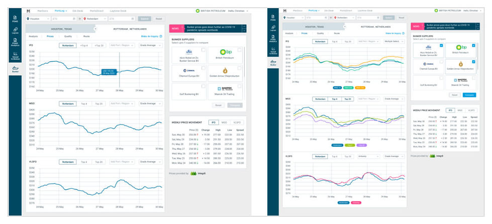
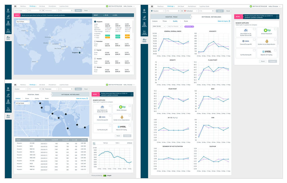
Voyages need fuel and it is not as simple as getting your car tank filled at a gas station. Where and when to fuel, and fuel price all play a crucial role in planning a voyage, it can save you both time and money when done right. The bunker feature allows operators to plan ahead and in real time using this feature.
Results & Learnings
Although we dont have a clear requirement from the client, we were able to deliver a solid concept for the application on a limited time. By working closely together, continous review and iteration.
Earlier on the process, we made a mistake at paying too much attention on details. With limited time, we decided to focus on the main features that will be crucial to the user.
The client’s feedback was positive and was happy with the initial concept and we were able to sign them off. Of course we are expecting a lot of iterations as we go through the details.


